Klick
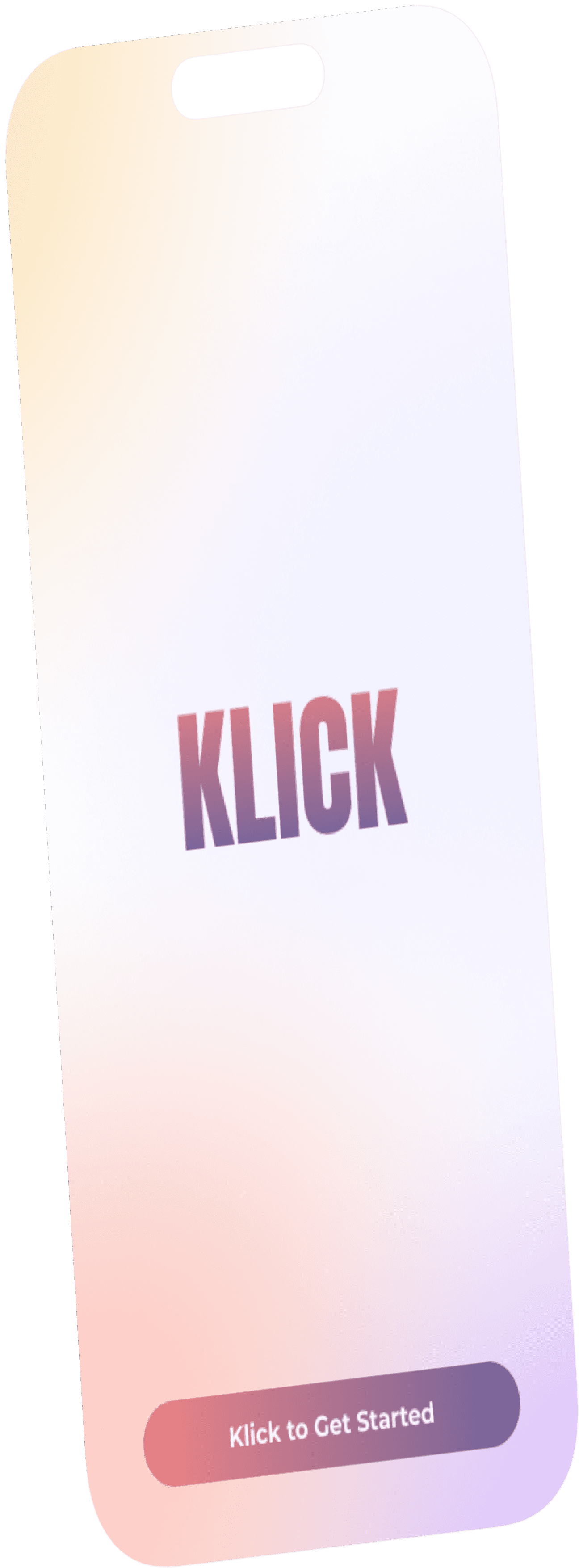
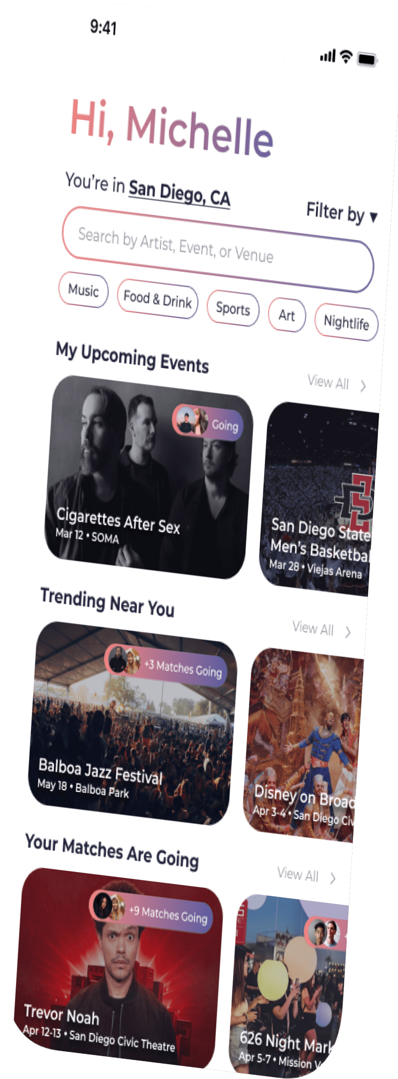
Klick, a mobile app concept, helps users discover events of interest and match with other interested users—making it easy to meet new people and find someone to attend with.
In this project, I focused on crafting an intuitive user experience that encourages community building through shared interests, while also addressing the common challenge of attending events alone.
TIMELINE
January 2024 - April 2024
ROLE
UI Designer
TOOLS
Figma
CONTRIBUTORS
Haley Chan
Cora Ding
Rain Dong
Kellie Huang
Vivian Liu
Fred Diamond (mentor)
Like dating, but for concerts, sports games, and fleas
CASE STUDY OVERVIEW
Design Approach
WE DECOMPOSED THIS DESIGN BY FIRST ASKING
How might we design an intuitive experience for event enthusiasts to easily discover events and connect with others to attend together?
To develop our mobile app, we began by brainstorming visual design concepts and analyzing existing dating and event apps. Next, we established an information architecture outlining core functionalities and features, before iterating on various page designs with guidance from our mentor.
Ideation
During our brainstorm, we drew design inspiration from apps that had features we wanted to incorporate. While dating apps focused on user matching and event apps on event browsing, we aimed to combine the best of both. Our goal was to create an app where users could browse events, view details, register, match with fellow attendees, and chat with their matches—all in one seamless experience.
We found examples of app concept features we wanted to incorporate in our own app:
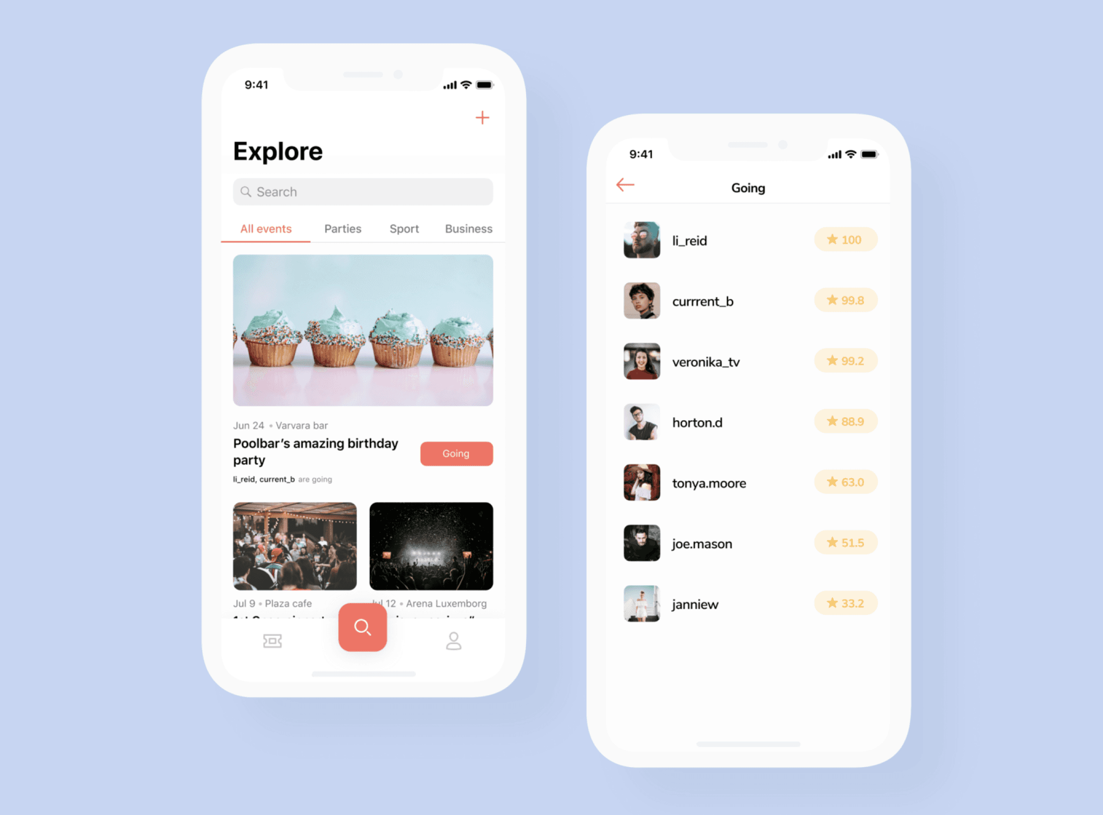
view who's going to an event… maybe your matches?
browse events by category
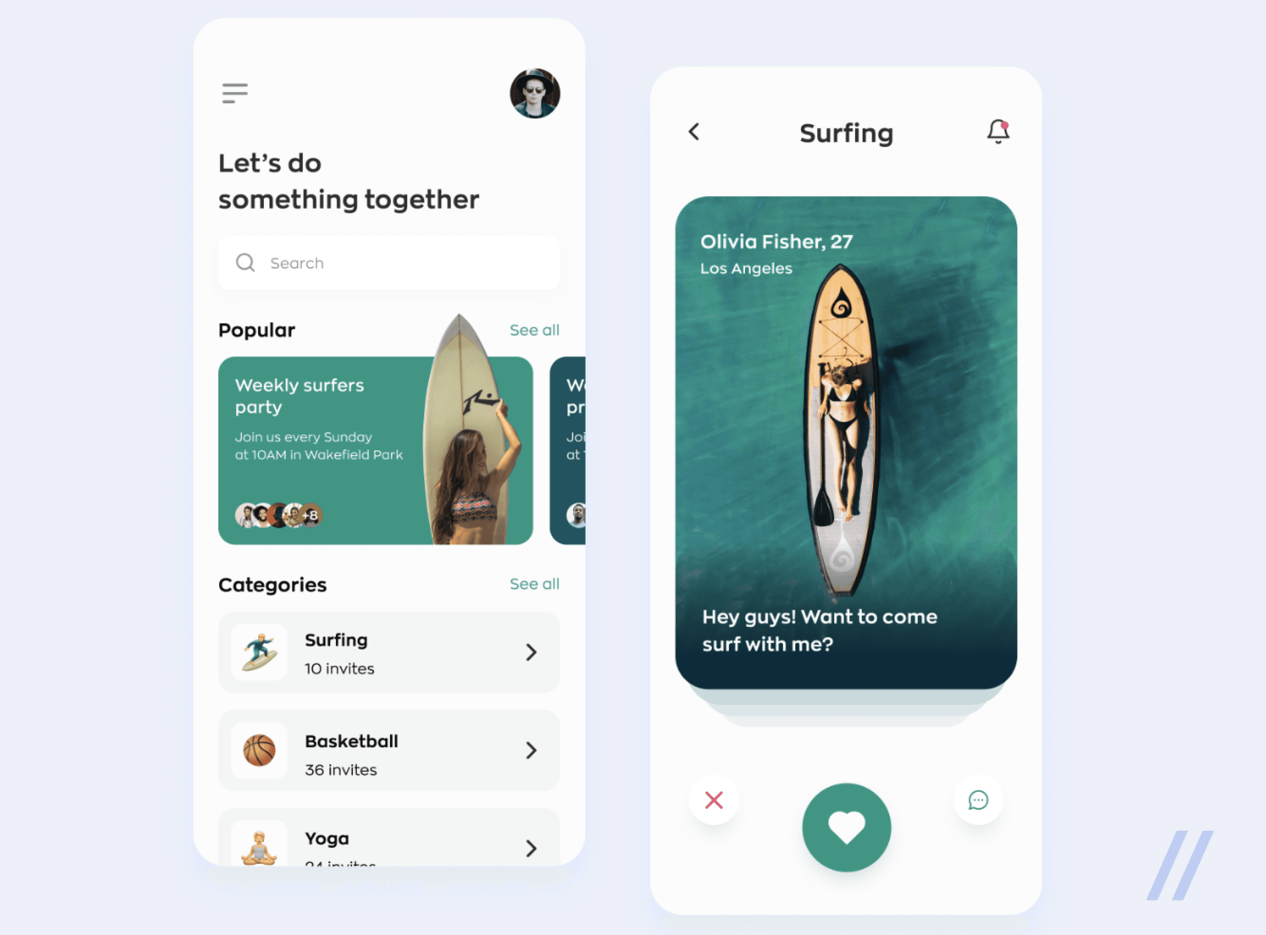
swiping on people and activities at the same time!
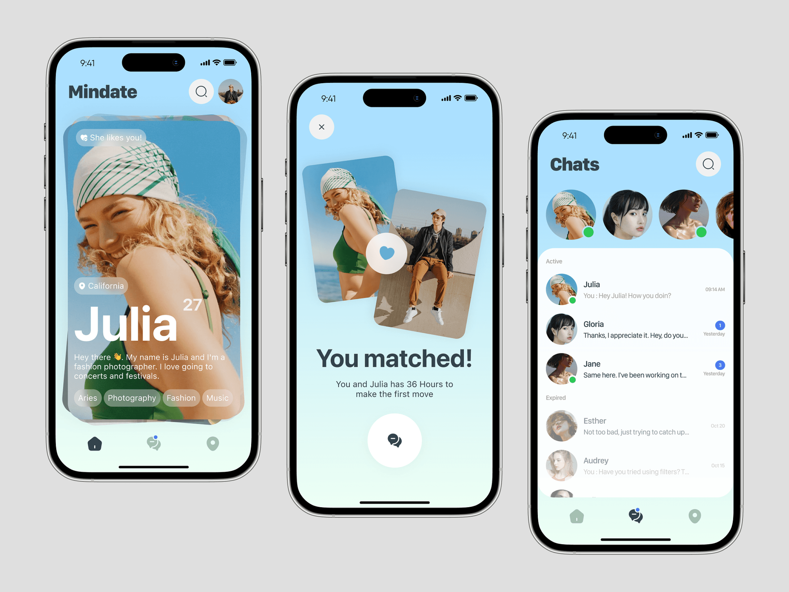
see potential matches' interests as tags on their profile
group conversations for organization—possibly by "date" and "friends" ?
Information Architecture
After identifying key features and functionalities, we developed an information architecture to map out the app's structure, helping us visualize the user flow and journey. From onboarding, users can navigate to the home/explore page, match page, chat page, or profile page.

Design System
Typography
Color Palette
klick pink
#F28482
klick purple
#5D5DA1
klick text blue
#22223B
base white
#FFFFFF
Primary
klick beige
#F2E9E4
klick yellow
#F6BD60
klick green
#80C87F
klick red
#A83030
Secondary
Body
Aa
Montserrat
abcdefghijklmn
opqrstuvwxyz
Headings
Aa
Montserrat
abcdefghijklmn
opqrstuvwxyz
Title
Aa
Montserrat
abcdefghijklmn
opqrstuvwxyz
Gradients
primary
button gradient
#F28482, #5D5DA1
secondary
button gradient
#5D5DA1, #F28482
profile
button gradient
#FA9884, #F6BD60
Explore Page Ideation
With our information architecture and design system in place, we all gained a comprehensive understanding of the app's user flow. Using this foundation, we each gathered inspiration from other leading matchmaking and event-ticketing apps to guide our own designs. Cora took charge of the onboarding screens and profile page, Kellie focused on the match page, Rain worked on the chat page, Vivian designed the event cards, and I led the design of the home/explore page.
I first performed a competitive analysis on the "Discover" pages of AXS and Ticketmaster in order to identify key features and design patterns that could enhance the user experience on our explore page.
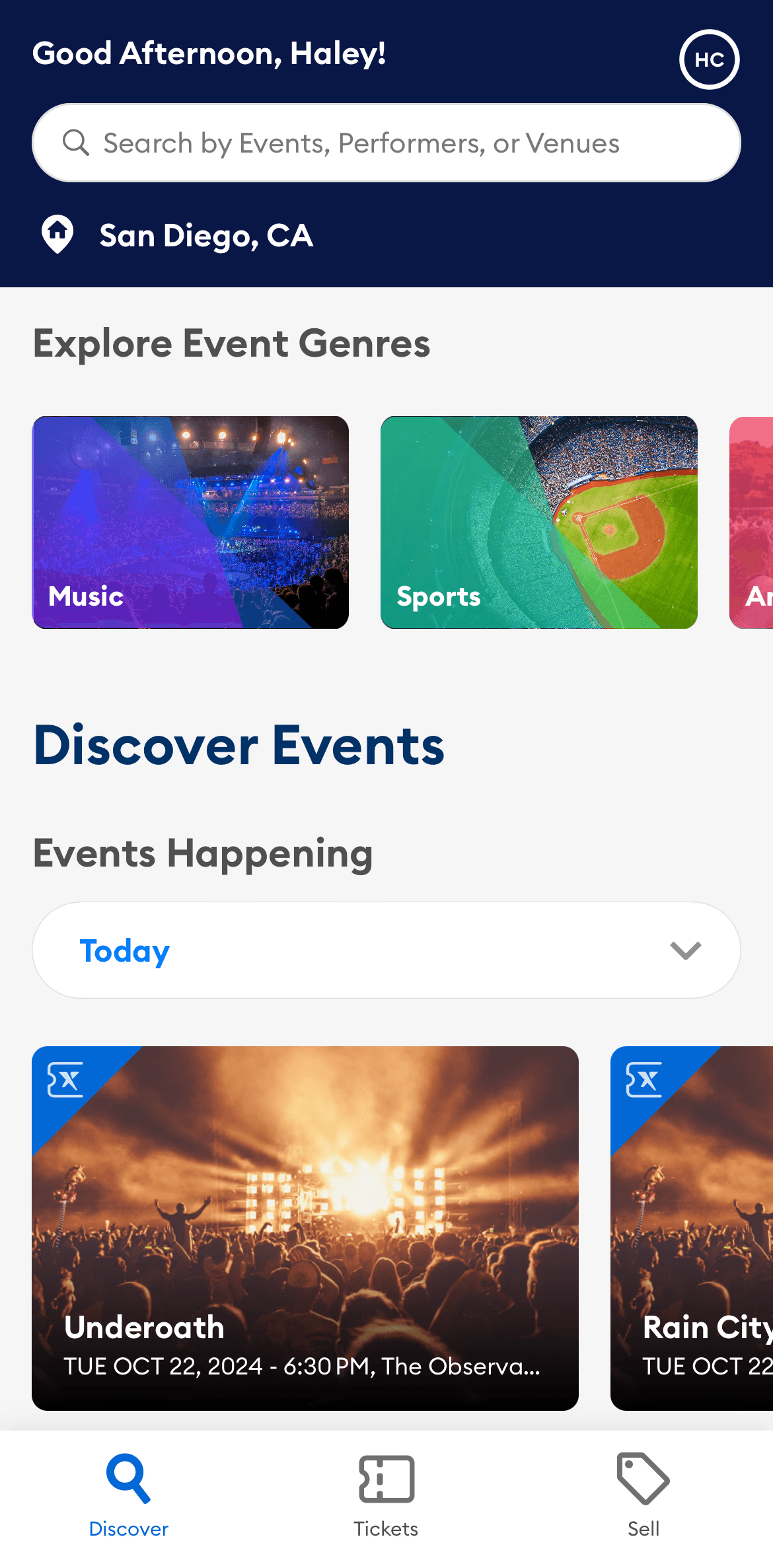
AXS
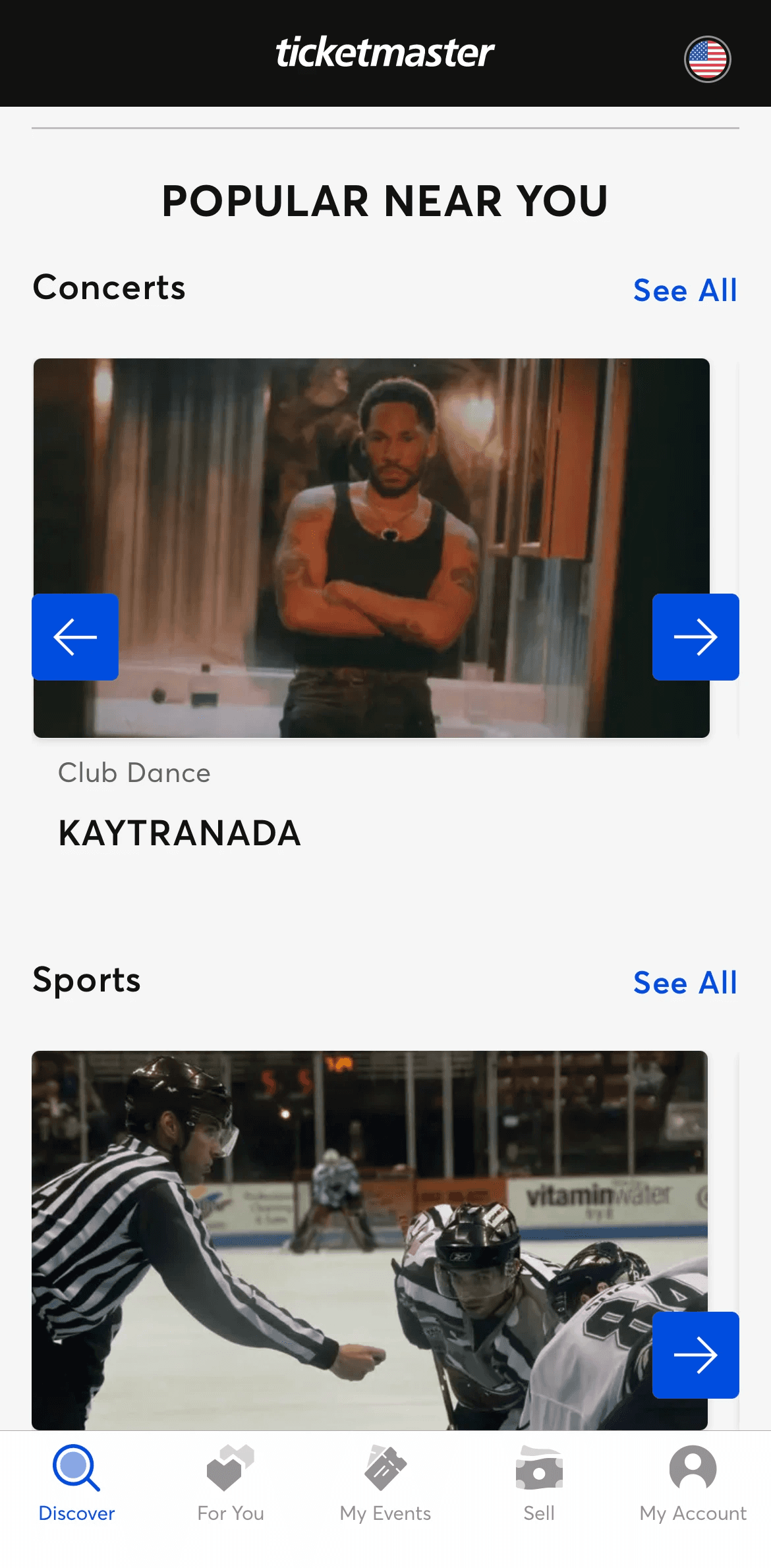
TICKETMASTER
navigation bar enables users to switch between pages efficiently
users can filter events by genre and date, helping curate their explore page
event cards are large, visible, and informative
users set their location to see nearby events without having to search
events categorized by social interest increases engagement and reduces time spent searching
one event card visible limits quick comparisons for events within each genre
Next, I incorporated color and images into the designs, creating a mid-fidelity prototype that allowed my team and me to better visualize what the user experience might look like:
Prototyping
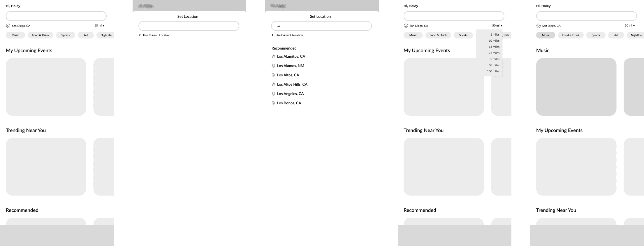
Based on our information architecture, I knew the explore page needed to enable users to browse and search for events. And after analyzing the explore pages of AXS and Ticketmaster, I decided to include a feature that lets users set their location to view nearby events, with filters for event category and distance. To create a more welcoming experience, I also designed a personalized greeting at the top of the page.
With these features in mind, I crafted lo-fi screens to map out the general layout of our explore page:
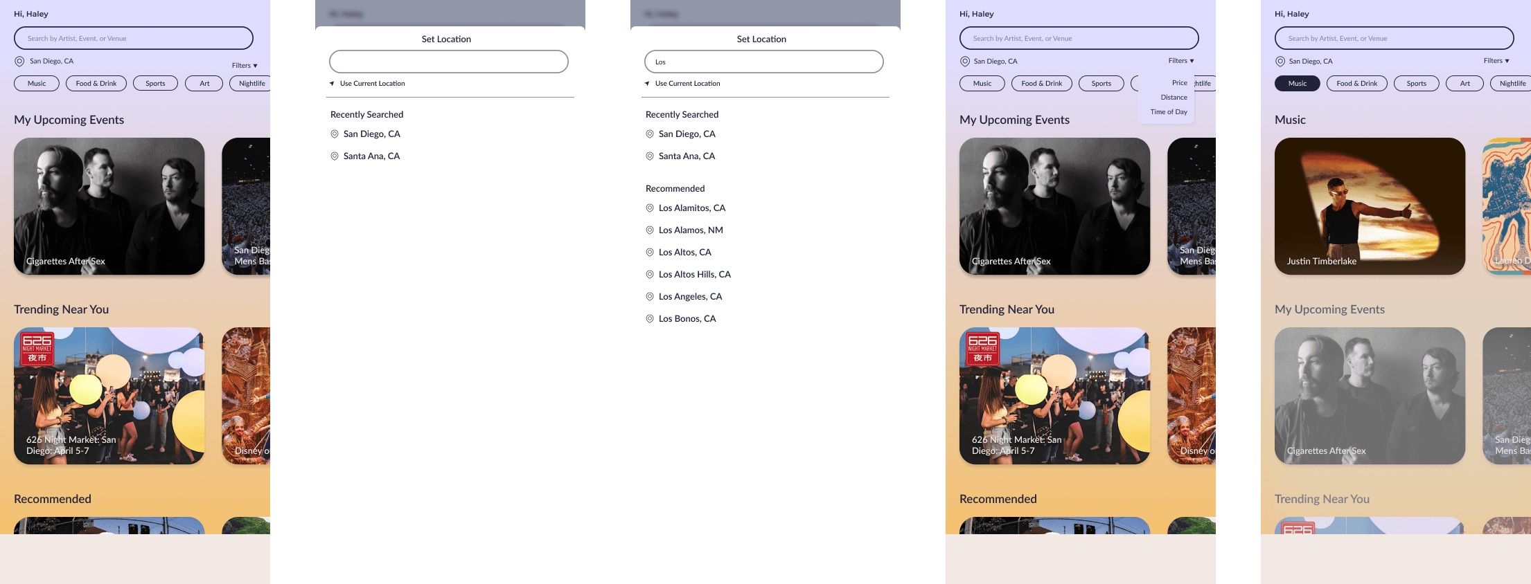
For my initial mid-fi designs, I used a linear background to add a pop of color. However, after presenting these screens to my team, I received feedback to switch to a white background for a more modern, streamlined look. Additionally, our mentor suggested increasing the text size for better readability and encouraged us to brainstorm ways to capture the app's spontaneity, incorporating features that reflect Klick's character into the landing page. This then led me to my final high-fidelity prototype of the explore page.
Final Explore Page
In the final iteration of the explore page, I enlarged the greeting at the top to create a welcoming feel and draw the user's attention to personalized content. I also added the date and venue location to the event cards, providing the user with essential information at a glance. To enhance the spontaneous theme of Klick, I included a sticker on each event card indicating how many of the user's existing matches have already RSVP'd for the event, which increases user interest in attending. This feature sets our explore page apart from other event-ticketing apps by emphasizing social interaction and community engagement, showcasing Klick's unique blend of event discovery and matchmaking.
On Klick's explore page, users can easily browse and search for events, set their location to find nearby options, and filter events by genre, price, distance, and date. With a quick look, they can view key details like event info and the number of matches already attending, making event discovery both effortless and engaging.



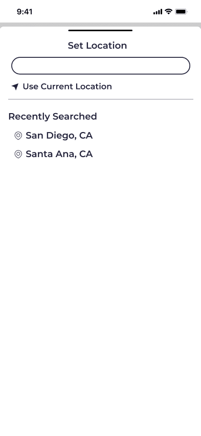


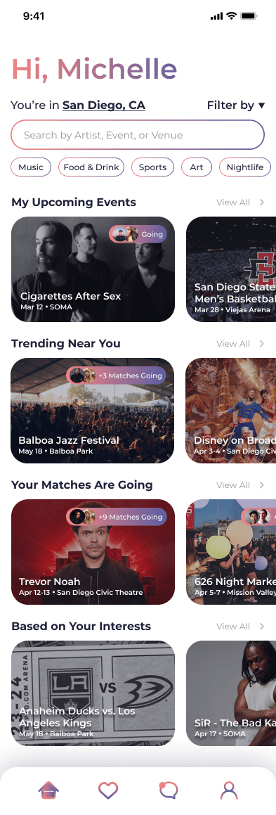
enlarged personal greeting
event cards display key details
see how many of your matches are going
Flows
Klick, an event matchmaking app, helps users find companions for events they’re interested in, promoting social interaction and community-building through the discovery of concerts, fairs, sports games, and shows. It addresses the common challenge of not having anyone to attend with, while also easing the awkwardness of a first date.
Upon opening the app, users are guided through the onboarding process, where they build their profile and select their interests, which personalize their explore and match pages. After setup, users are welcomed at the top of their explore page, adding a personal touch to their experience. As they browse events, they can click on those of interest to view details, RSVP, and match with fellow attendees to find someone to join them.
Beyond event-based matching, users can also connect with others through the match page, further emphasizing the app’s social focus. After matching, whether through an event or directly via the match page, users can chat with their matches in the chat page, which categorizes conversations into "Date" and "Friends." Finally, users can manage their profile through the profile page, adjusting visibility settings and modifying account information related to security and preferences.
interact with the explore page here!
interact with the full Klick app here!
What I Learned
Design Systems. Consistency in color, typography, and spacing within visual design helps convey a brand's identity and values.
Designing for Mobile. I learned how to use visual elements to effectively communicate an app’s purpose in a compact, touch-driven space.
Prototyping. I incorporated feedback at each stage of iteration, and ultimately created an interactive mockup to bring the app’s functionality to life.